

I was discussing children’s books with my daughter recently and thought back to some of my favourite stories from my own childhood. One of these which came to mind was a book called “Fattypuffs and Thinifers“. The story is about two children, brothers, called Edmund and Terry who are physically very different to each other – one is quite overweight and the other is particularly slim. The good friends descend on a journey deep into the earth to discover two feuding nations living there; the chubby, slovenly, easygoing and happy ‘Fattypuffs’ and their enemies across the ocean – the extremely skinny Thinifers whom by nature are punctual, well-organised, stringent and rude. The lands operate a kind of body shape apartheid and the two brothers get separated.

Despite its title, I think the tale is much more than 1930s-style body shaming. In many ways, it must be seen as the opposite. The moral of the story seems to be about acceptance of difference and how much more is achieved through the embracing and blending of such differences. The conflict described in the book is also a skit on the absurdity of the kind of nonsensical international dispute which had led to the terrible slaughter of World War I. This cataclysm had happened just a little over a decade before it was published. The book’s author was a former French army officer, an Anglophile called Andre Maurois, who had spent the Great War as a Liaison Officer and translator to the British Army.

For a preposterous children’s story, the narrative suddenly takes a very dark turn at one point, starkly describing the cruelty and horror of warfare as seen from the eyes of one of the two ‘surface dwelling’ children:
He heard the shells going W-H-I-I-I-Z over his head and suddenly exploding with a terrific C-R-U-M-P. He saw his Thinifer friends cut in half by fragments of steel (although they were so thin there was scarcely anything of them to hit). In the evening he heard aircraft zooming over the camp, and for the first time in his life he realised that an aeroplane was not always something to look up at and admire… As they advanced, they saw villages destroyed by gunfire, women and children wounded, little boys who had lost both father and mother.

Clearly, the author, an ex-poilu, was under no illusions about the horrors of war and was keen to help his young readership understand that too. Trenches which had loomed so large in the imagination of the Great War survivors feature in Maurois’ book.

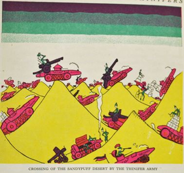
In macabre – almost surrealist – humour, he amusingly describes how Fattypuff engineers solved the problem of fitting their rotund soldiers into narrow trenches which could still offer them protection from shellfire.
“The difficulty about these trenches, as the surface dwellers dig them” continued the Marshal, “is that they are much too narrow for an ordinary Fattypuff to be able to get into them. On the other hand, the wider they are the less use they are as protection. But the head of the Corps of Engineers, General Sappapuff, has invented a sort of globular trench, narrow at the top and rounded at the sides, which solves the problem. The only objection to it is that it can only be entered at either end, so that it is not possible to make a mass sortie. However, as we only intend to fight a defensive war, this is of no importance. On the contrary.”

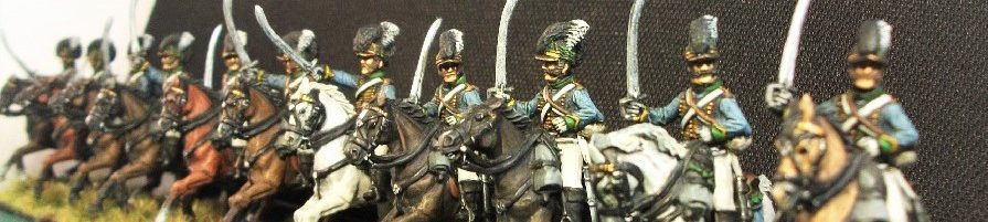
Uniforms of the Fattypuff and Thinifer armies:
Looking at the book now, I’m particularly interested in the illustrator’s interpretation of their uniforms. The book’s characters in my own copy are brilliantly depicted throughout by Fritz Wegner, a Viennese-born illustrator who lived in London and died as recently as 2015. He was just one of a number of illustrators who, over the 90 years since the book’s first edition, have attempted to illustrate the military uniforms of the Fattypuff and Thinifer armies in their conflict with one another.

The very first edition of Fattypuffs and Thinifers in the English language however featured full colour images by Jean Bruller, a French artist and writer who produced his own absurd illustrated novels, even clandestine ones published during the Nazi occupation of his country. His early depiction of the two forces is radically different from what would follow. The Thinifer soldier is shown in a green uniform with what appears to be a pointed helmet, perhaps with a white cloth covering. He has black knee-length boots and red cuffs.

His heavyweight adversary is in a distinctly pink-looking red uniform. That may be down to the printing ink rather than the original intention but his puttees suggest differently, being more distinctly red. In addition to those puttees, the style of the rest of his uniform is distinctly modern (for 1930) with ammunition pouches, green identification flashes on his lapels and some kind of white headgear which may well be a steel helmet.

The book which I remembered from my childhood had the cover below. It’s an earlier edition of the one currently in my possession and was also illustrated by Fritz Wegner. It shows the two adversaries in the book in their full military attire; two proud soldiers of the Fattypuff and Thinifer armies (you can probably guess which is which). It shows the Fattypuff general wearing a more distinctly red-coloured coat than the Bruller version. He also wears orange-striped white riding breeches and brown Hessian boots. His hat is a gold-edged bicorn worn in transverse Napoleon-style. A sun or yellow flower badge with red centre is seen on the front. He wears an orange sash over his shoulder tied in a knot at his side.

His thin adversary meanwhile wears what appears to be a kind of navy-coloured hussar dolman with gold braid. A white pouch belt is just visible. The illustrator depicts two straggly coat tails as well. His riding breeches are red and he wears knee-length riding boots of black leather. Signs of his rank can be discerned in the ornate trefoil scrolling on the sleeves. The headdress appears to be some kind of very tall black shako with a red plume. Being senior officers, both soldiers feature extensive gold aiguillettes and large, frilled epaullettes.
In the book, the author does briefly describes the Fattypuff officer’s uniform;
…At this moment, a Fattypuff officer with a magnificent gold-embroidered, red uniform entered the audience chamber.
This basic description certainly seems to match most of the repeated depictions shown across other editions of the book, (pinkish looking original version aside). It seems that Wegner’s brilliant illustrations inside the book have been retained in following editions with only cover designs being subject to interpretation by new illustrators. This has meant that in effect, Wegner’s original 1960s uniform designs have been the template for subsequent illustrators ever since though, as we will see, this has not entirely stifled new interpretations of the Fattypuff and Thinifer uniforms.
Fattypuff coats are reliably reproduced in red across other various covers too, although the uniform detail is subject to different interpretations. I was unable to locate a description of the Thinifers uniform within the pages of my book but, no doubt thanks to Wegner, these with equal regularity are depicted as being dark blue or black, once again with the sole exception being Jean Bruller’s original illustrations in green.

Wegner revisited his cover illustration for a later edition. This later depiction (below) of both the Thinifer and Fattypuff coat colours shows that he broadly kept faith with his original 1960s uniform designs. The Fattypuff officer below however now has a blue-coloured sash. He has also adopted Thinifer-style yellow braiding on his coat and now wears yellow breeches with red stripes instead of the earlier white with orange version. Coat tails are now visible and the vaguely yellow plume has become a falling white over red affair. Gone is his bicorn hat and his headgear is now a black shako which is reminiscent of an Albert Pattern shako. Both colour and style of cuffs remain the same.

The Thinifer family scene below shows the soldier in a very similar form of dress to the previous edition. The navy-blue coat with yellow braiding, the red breeches (now with added yellow stripe) and the tall black shako with red plume all accord with the previous version. Facings are now red, not yellow, although we might assume this could be accounted for by individual regimental distinctions. White plumes are also visible and the white pouch belt has been dispensed with (or could this be an adaptation for the off duty ‘walking out’ order of dress?!)

The following 2013 edition by Vintage Publishing below has a cover which still reasonably closely reproduces the uniform of the Wegner books. The illustrator, Kristyna Lytten, has chosen to retain the original Wegner style of headdress (Fattypuff bicorn and Thinifer Shako) with broadly similar coat colours. However, she has now coloured the headdress to match the coats with even their plumes adopting the strict red / blue colour scheme. The Thinifer soldier retains his hussar-style braiding and now once more with a white pouch belt. There’s something curiously naval about the men’s dress, an effect further emphasised by the appearance of two ships in the harbour seen in the background.

Tygertale blog ran a very interesting Q and A with the illustrator Kristyna Lytten in October 2013. Kristyna Lytten described how the original illustrators inspired her own artistic vision.
I think [Jean Bruller and Fritz Wegner’s illustrations] are great. In fact the illustrations by Wegner are in the new version. I would have loved to have been asked to illustrate the interior illos to. But Wegner’s illustrations and F&T really do come hand in hand, it would almost be a shame to discard them. And I think children and adults alike will find them very humourous. I know I did.
With Wegner’s illustrations remaining in the pages, it explains the general continuity adopted by successive new cover artists. A more radical redesign can be seen in the distinctive style of Sean Sims who has a number of interesting variations. The Fattypuff’s headdress is now some kind of a shako or large cap with a yellow band and featuring a white Maltese cross centre. He wears no sash, adopting instead a white crossbelt and black waist belt. Facings are black. The Thinifer general meanwhile has adopted the kind of bicorn previously worn by the enemy in both previous illustrations and has even gone so far as to mimic the Fattypuff officer’s central yellow/red flower also! The navy-blue of the Thinifer uniform appears now to be very dark, very possibly black. Gold braiding loops are still visible, the waist belt is yellow and facings are red. Riding breeches have remained red and the familiar black riding boots are also still there.

Unfortunately, I am unable to identify the illustrator of the cover of the next edition. It’s a very detailed illustration which shows the Thinifer officer wearing a style of spiked helmet which almost certainly based on the German Pickelhaube. His navy-blue uniform has now become a light or sky blue. The uniform retains the familiar yellow braiding loops on the chest, straggly coat tails and also the frilled epaulettes. However, he wears curiously naval knee-length trousers with white stockings and buckled shoes. So we have mid-17th century naval legwear strangely juxtaposed with early 20th century infantry headgear! And if that doesn’t make those of us with an interest in military uniforms discombobulated, we note that he also on this occasion wears a cavalryman’s white gauntlet gloves!

The Fattypuff officer that he is jabbing an accusatory finger at has now brought back the old black bicorn with an added red feather plume. The familiar flower device on the hat has the same colours but is now reversed. Also back in fashion are the black Hessian boots and the orange sash tied at the side. His coat appears to be in the late 18th century style rather than the 19th century tunic seen on other covers. Such an attachment to antique military equipment could explain their eventual defeat at the hands of the Thinifers!

Today, more conscious of judgemental attitudes to body types and difference, we might consider that the terms ‘Fattypuff’ and ‘Thinifer’ derogatory. Certainly, Andre Maurois has lots of fun playing with how the uniformly similar body shapes of the two societies play out in their respective societies’ culture. However, the key message of the story is really one of acceptance and inclusiveness as the Fattypuff and Thinifer nations join together to form the United States of the Underground. Older generation Thinifers are suspicious and xenophobic, but the younger people embrace the different qualities and culture of the Fattypuffs as the inhabitants intermingle and, increasingly, intermarry.

In 2013, Tygertale blog suggested that this postwar children’s story could be read as an anticipation of the European union’. In 2018, it now reads more like an epitaph. We exist today in a world resurgent with nationalism and xenophobia. As such, one can only take comfort from the positive and peaceful coming together of two such very different peoples described in Maurois’ tale.
